

Design system
Every design system needs a solid foundation, which is why I established clear principles, consistency, and components designed to scale and evolve alongside the product, enabling us to build more cohesive experiences that align design and development.
¿Why is necessary?
Because it allows us to build digital products more consistently. It serves as a shared foundation between design and development, defining principles and styles that help maintain consistency and thus facilitate the product’s evolution. To sum up, it also helps maintain:
Promotes visual and functional consistency
Reusable and scalable components
Better communication between design and development
More efficient workflows
Greater clarity for development teams
A solid foundation for product growth

Atomic design principles
📝
Atomic design principles 📝
Atomic design is a modular approach that breaks interfaces into reusable pieces, making their structure clear and connected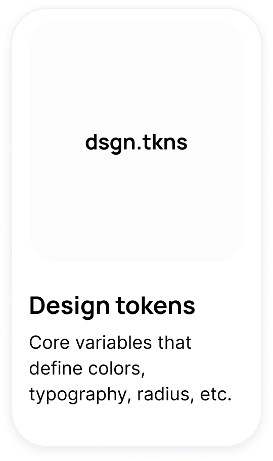
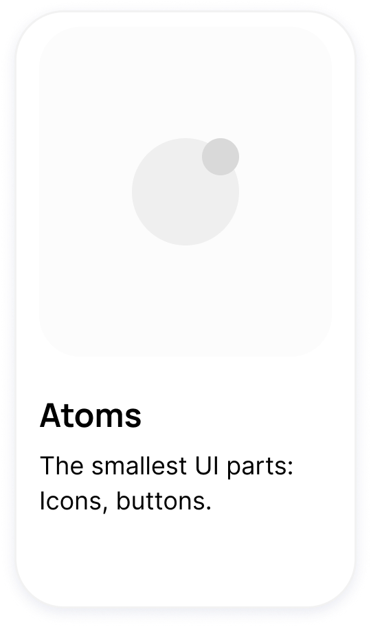
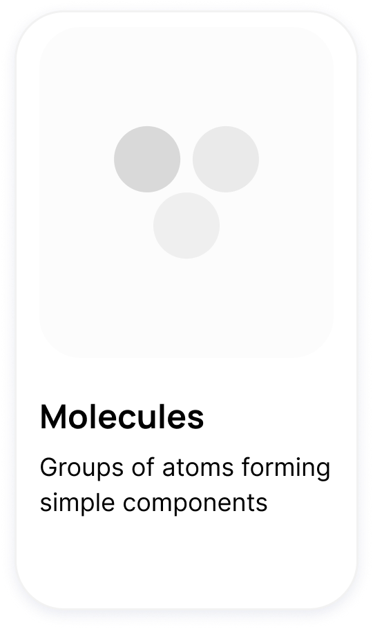
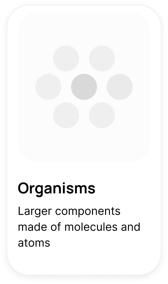
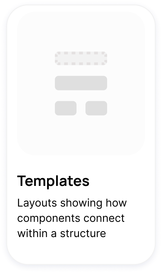

A unified system of reusable foundations and components brings clarity, consistency and structure to every interface.
Smart components
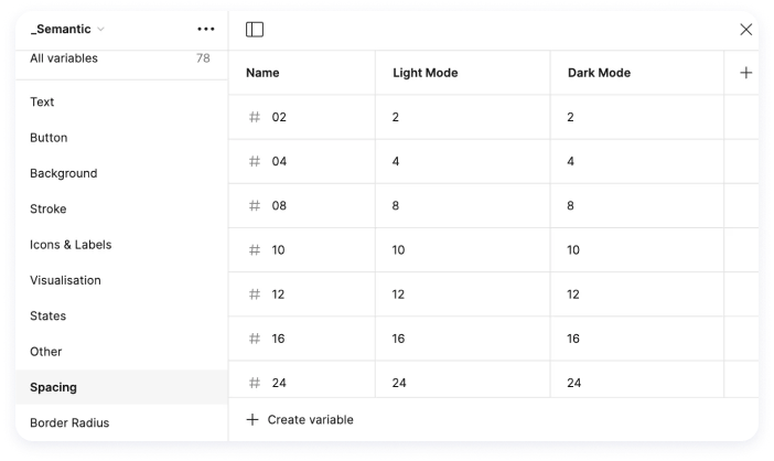
Variables allow you to centralize and manage key properties of the visual system—such as colors, fonts, spacing, and sizes—facilitating product consistency and scalability.
Implementing them helps optimize workflows, simplify global changes, and build interfaces that are more flexible, maintainable, and aligned between design and development.

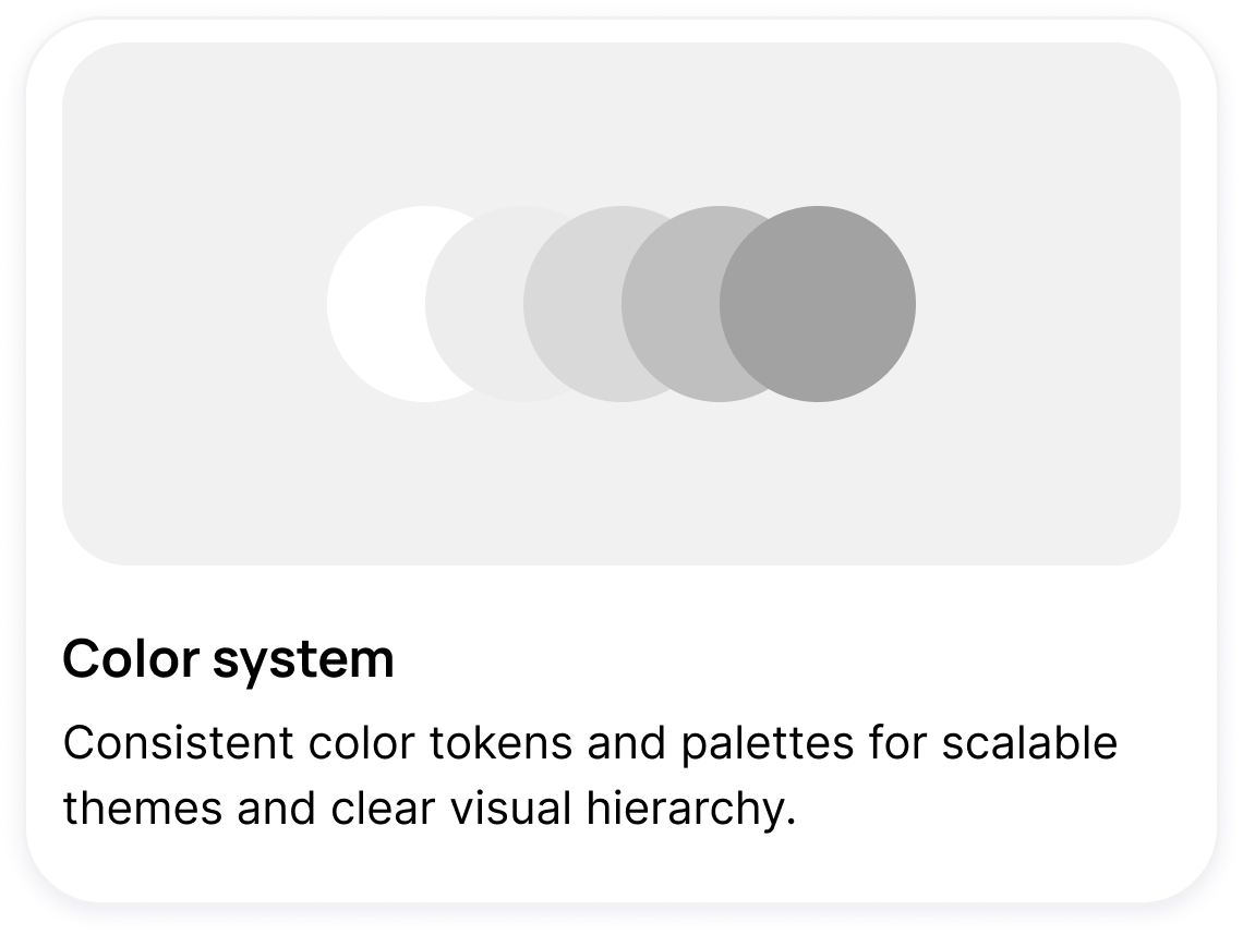
Color system
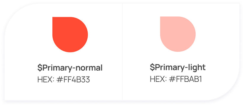
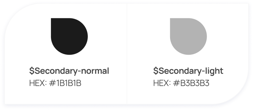
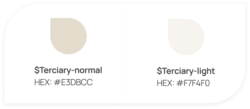
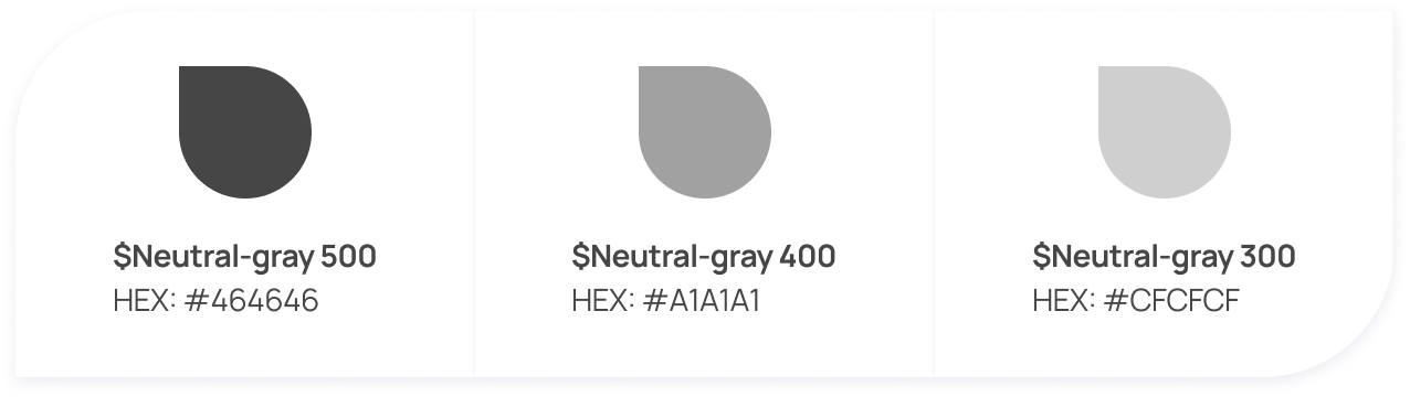
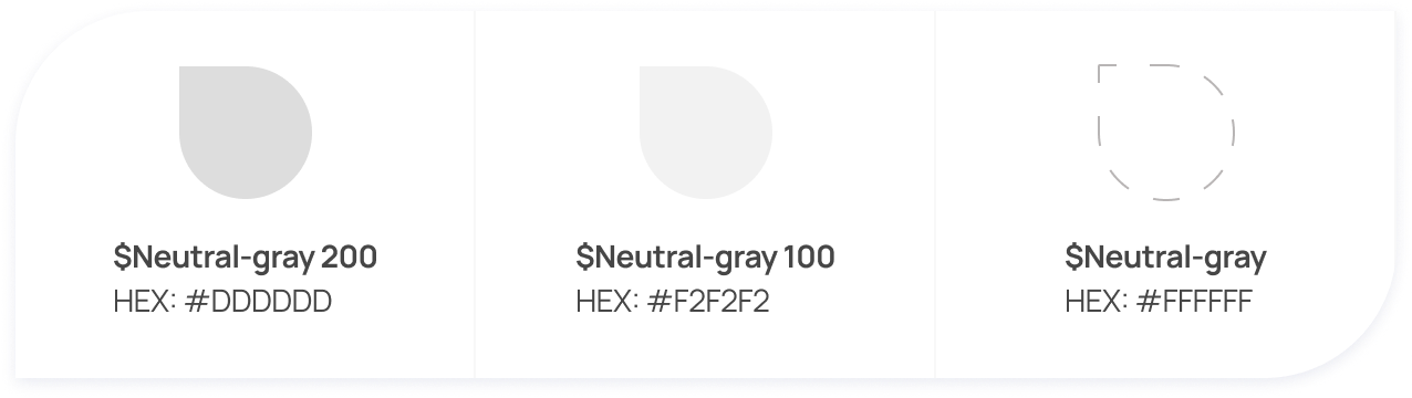
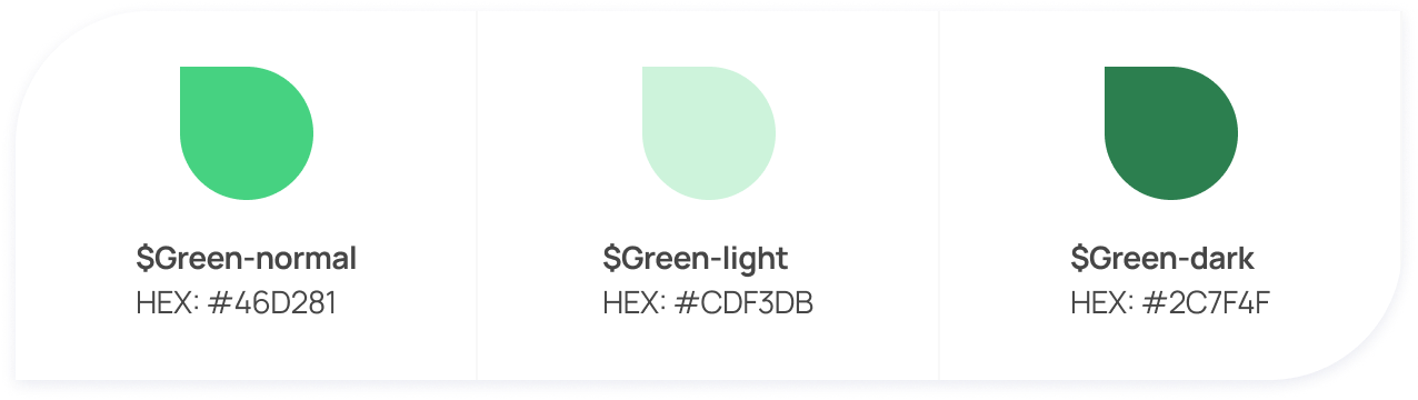
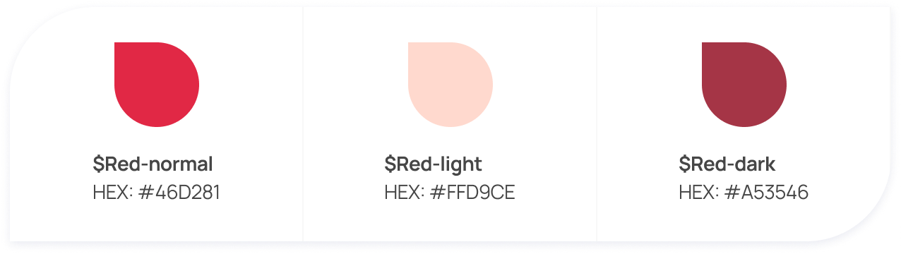
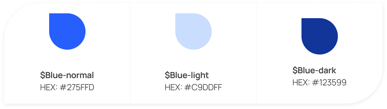
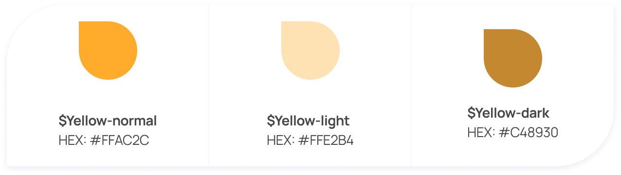
They can reflect your brand’s personality, attract users, and convey your message with a unique identity. Any user interface design system typically places special emphasis on colors. Color can define the overall atmosphere, tone, concept, and connotation of the product ecosystem.
brand colors
Neutral colors
Text feedback & tags colors
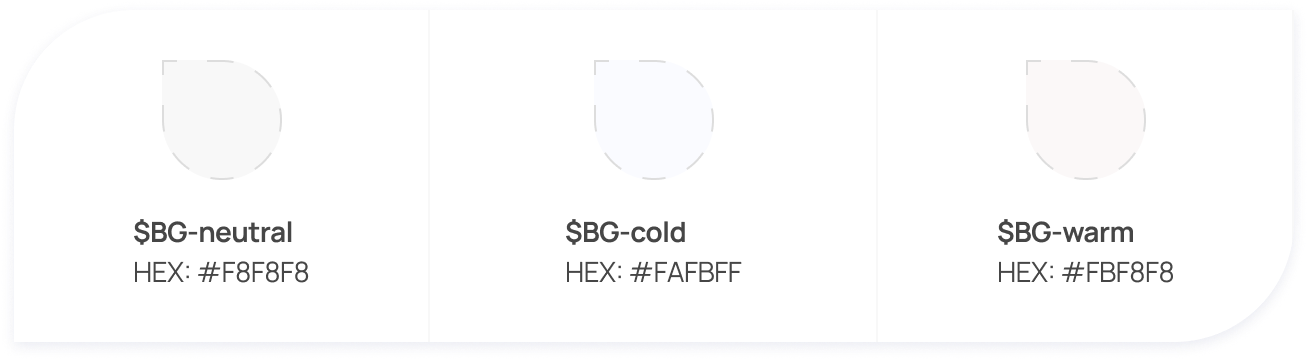
background colors

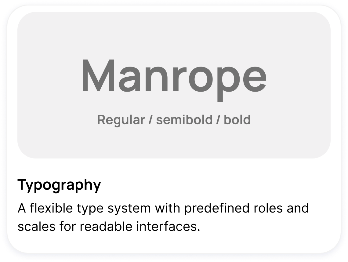
typogrAPHY
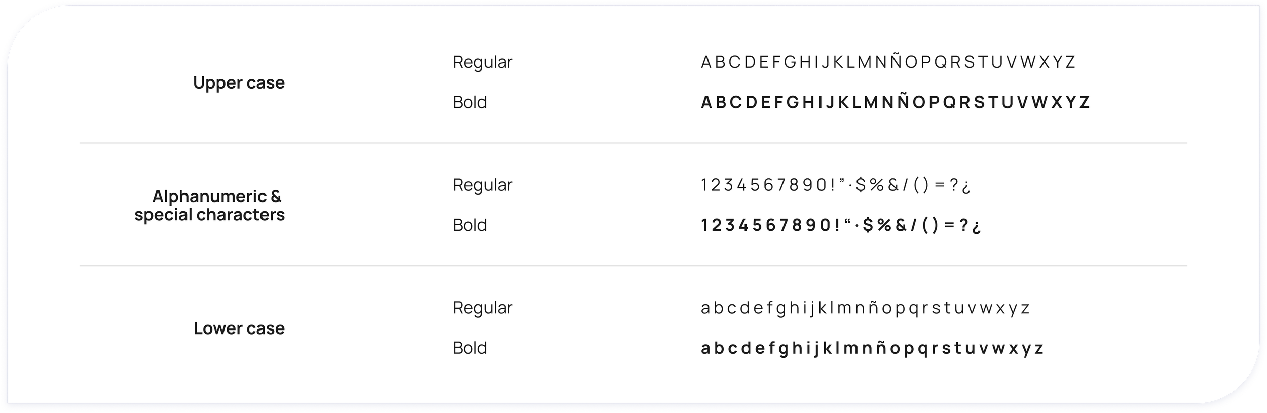
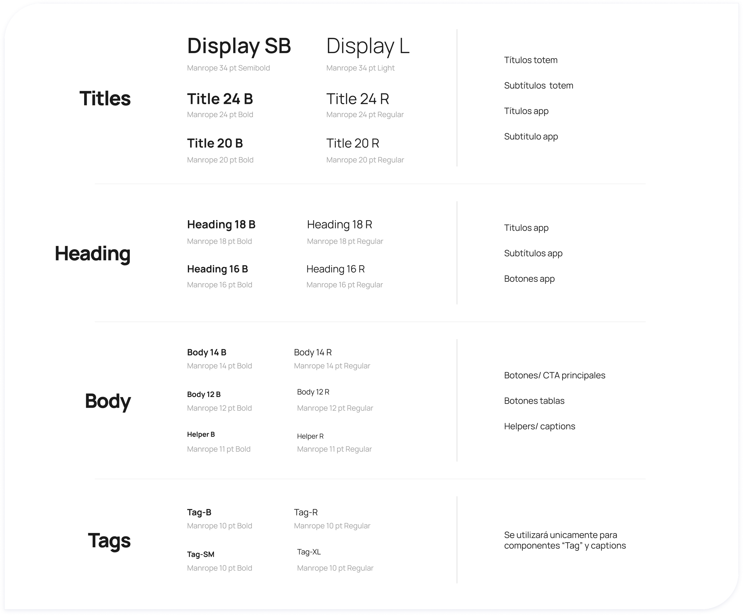
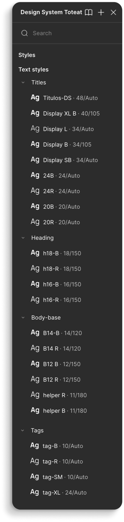
The typographic system defines text styles as design elements and explains how they should be applied depending on the context. A wide range of organized text styles makes it easy to select the right option for any screen or interface element.


grid
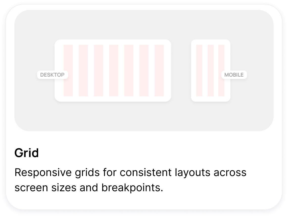
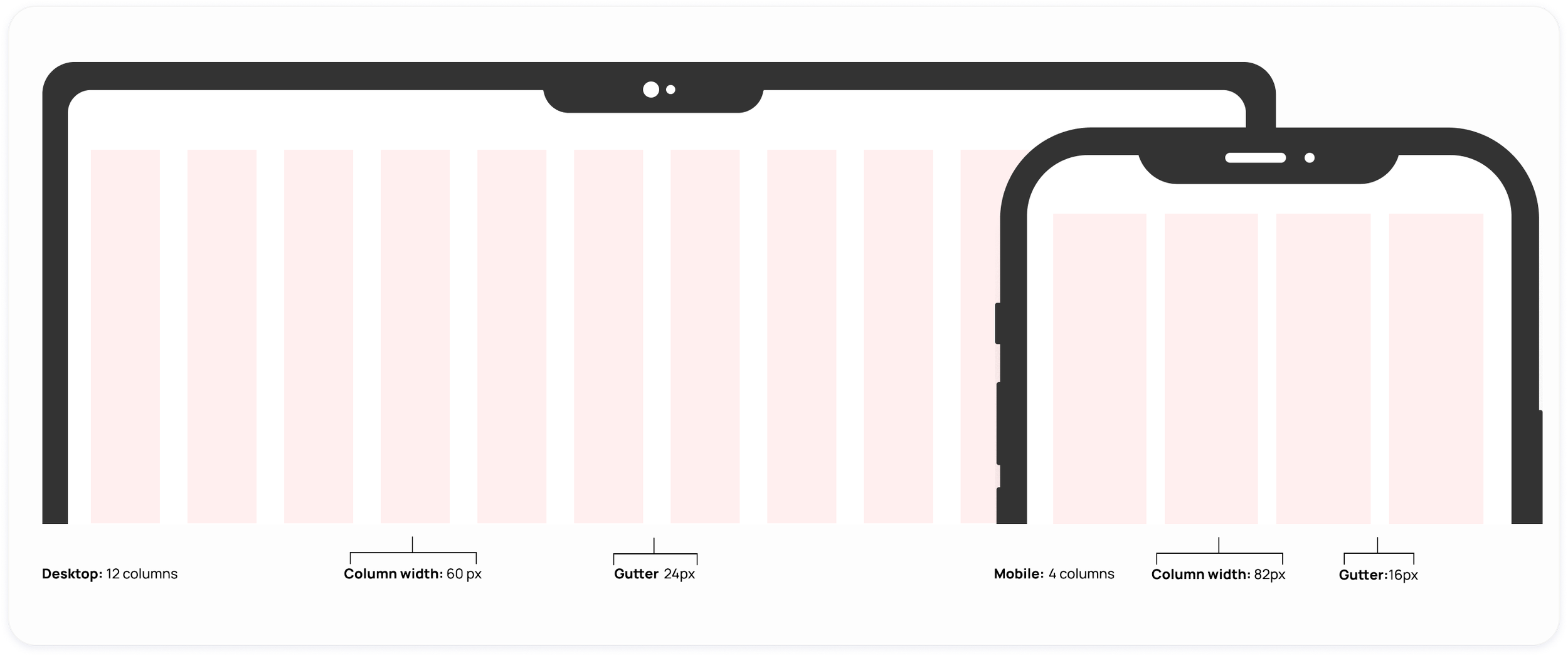
The grid is the structural foundation for all visual elements, from typography to columns, boxes, icons, and images. It serves as a guide for all creative decisions, supports the content, and also creates a coherent and adaptable design framework

CORNER RADIUS
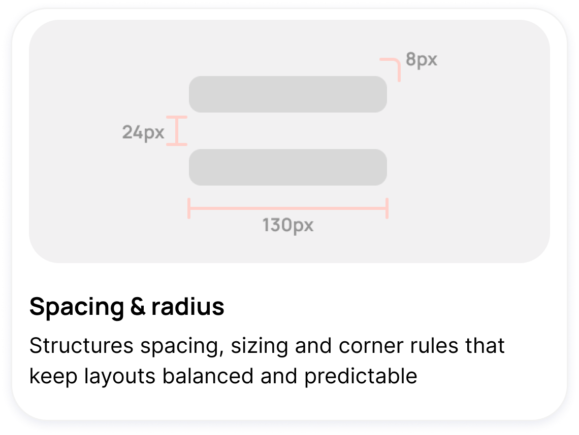
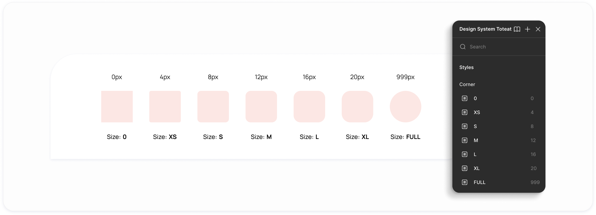
To ensure consistency throughout the UI, I've created a modular system based on 4-pixel increments. This system helps maintain a consistent look while allowing for flexibility among the various components

Shadows
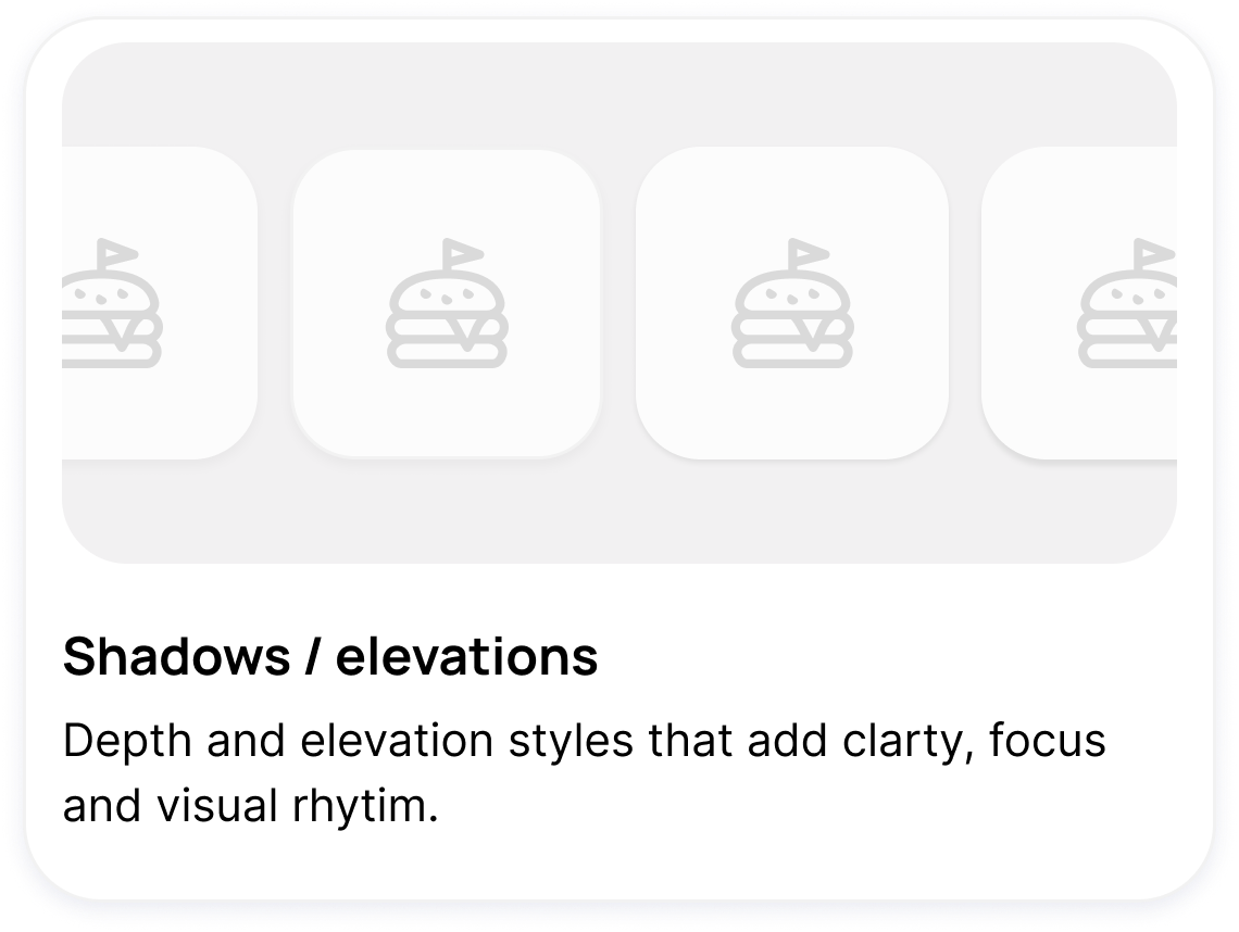
Creating a shadow system helps establish visual hierarchy and depth in the interface, and includes a set of consistent elevation levels that are used across various components, such as cards, tabs, modals, bottom sheets, etc.

iconogrAPHY
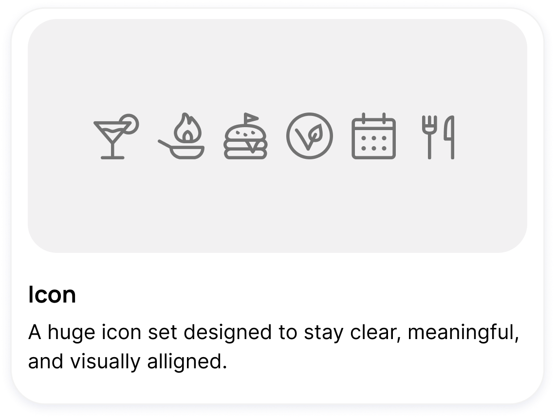
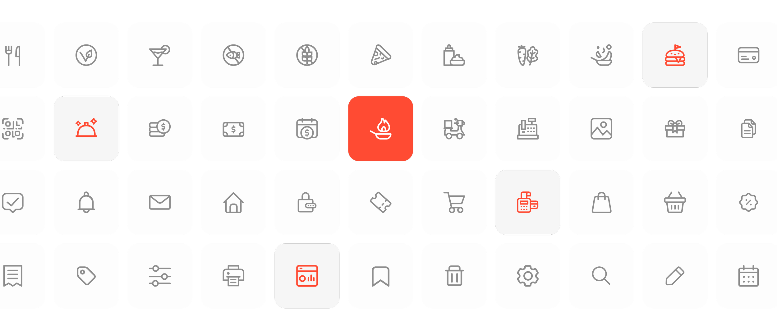
They should be used to aid understanding and reduce cognitive load when it is necessary to highlight an action, a command, or a specific piece of information. I decided to create custom icons for the entire brand ecosystem, based on specific needs, in order to better convey the brand’s identity.

buttons
Buttons are elements that convey a call to action to the user and allow them to interact with web pages in various ways. The text on the buttons indicates what action will be taken when the user interacts with them.
____ base sizes•
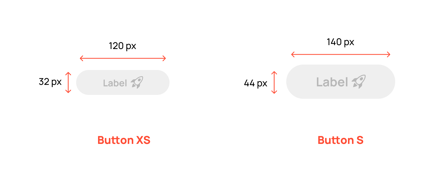
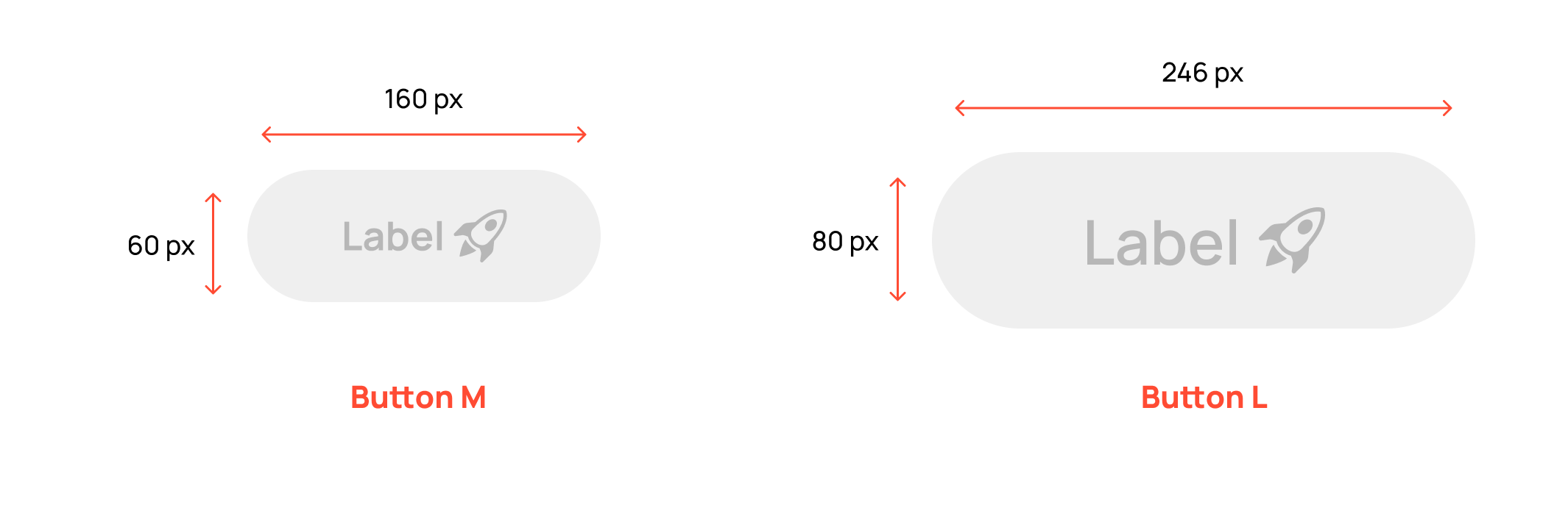
____ basIC STATES•
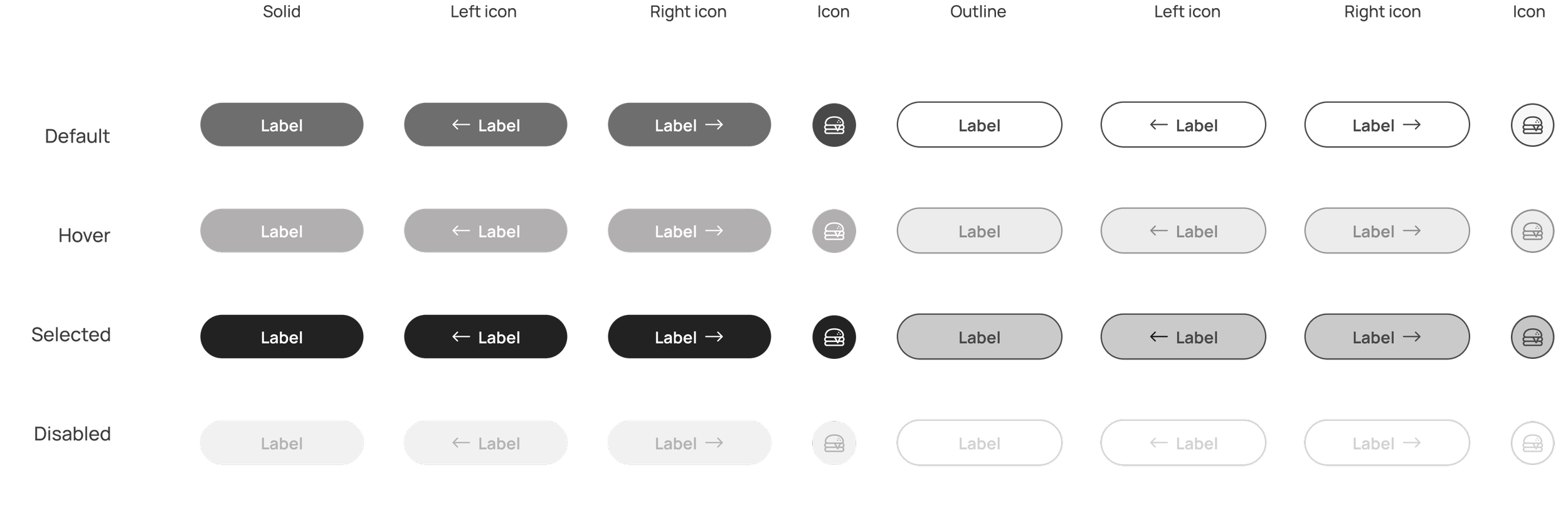
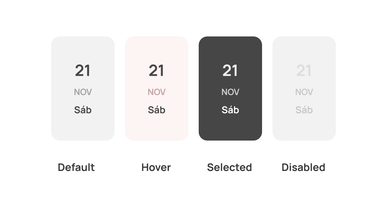
____ extras•
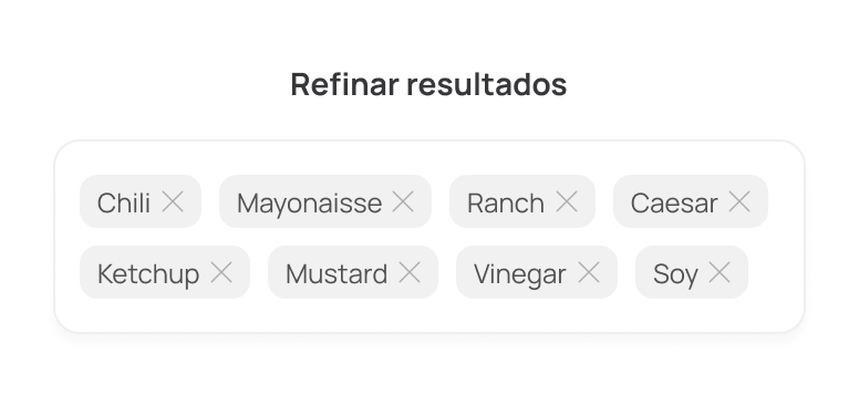
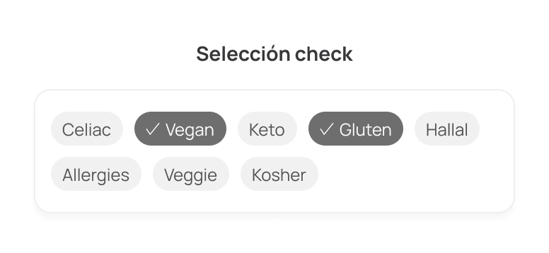
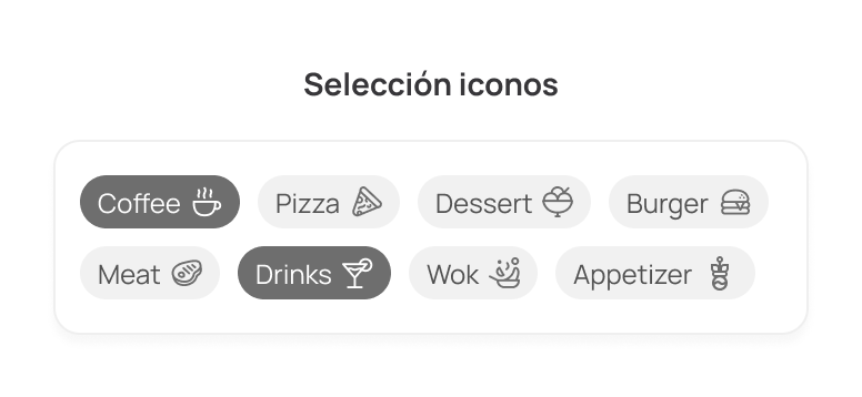
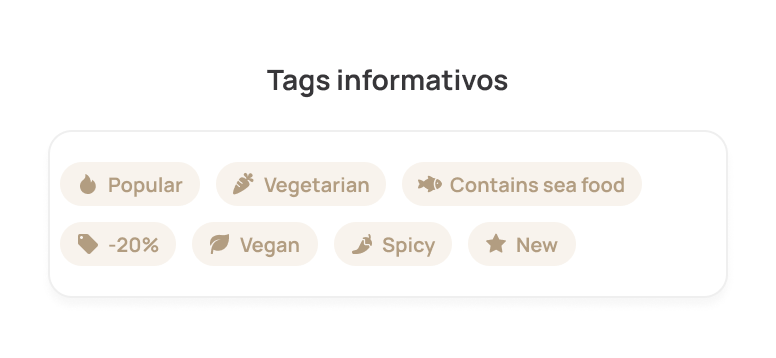
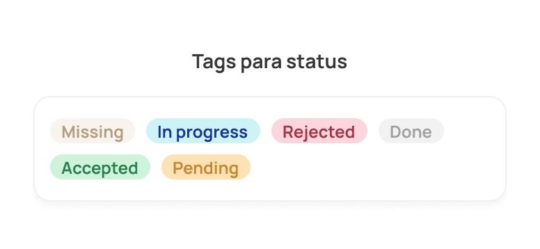
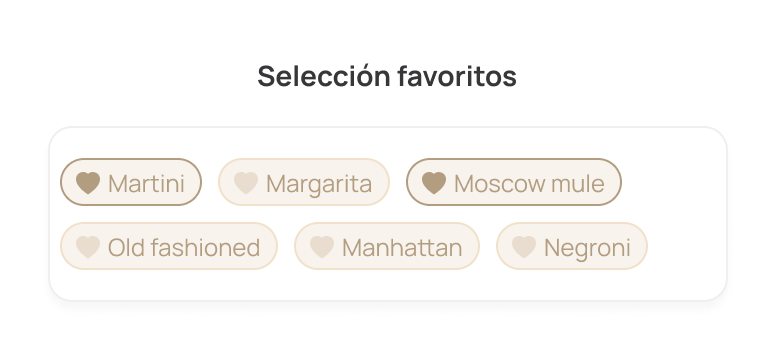
____ Tags / chips•
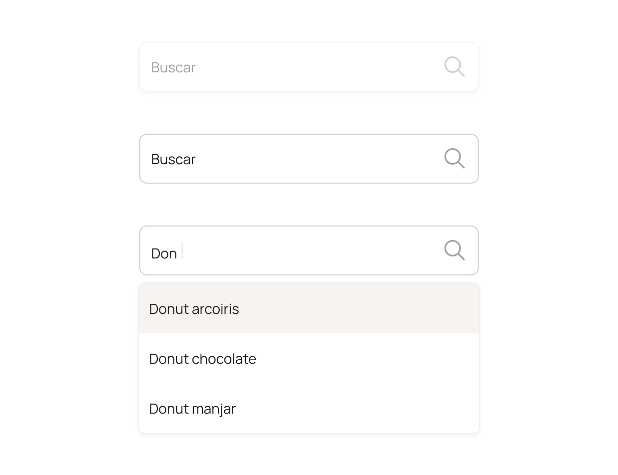
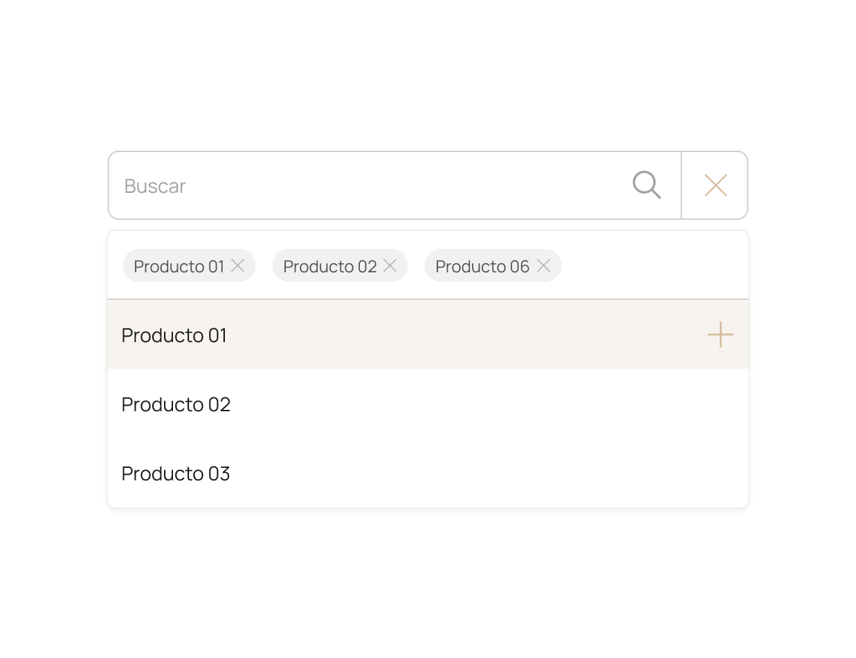
____ search•

inputs
____ Text input field•
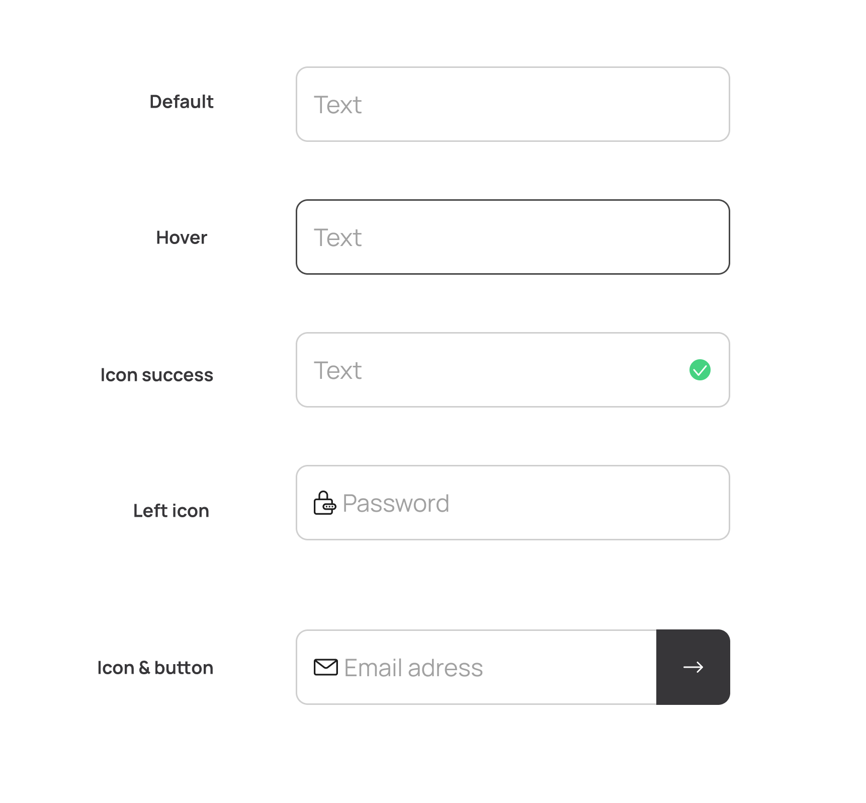
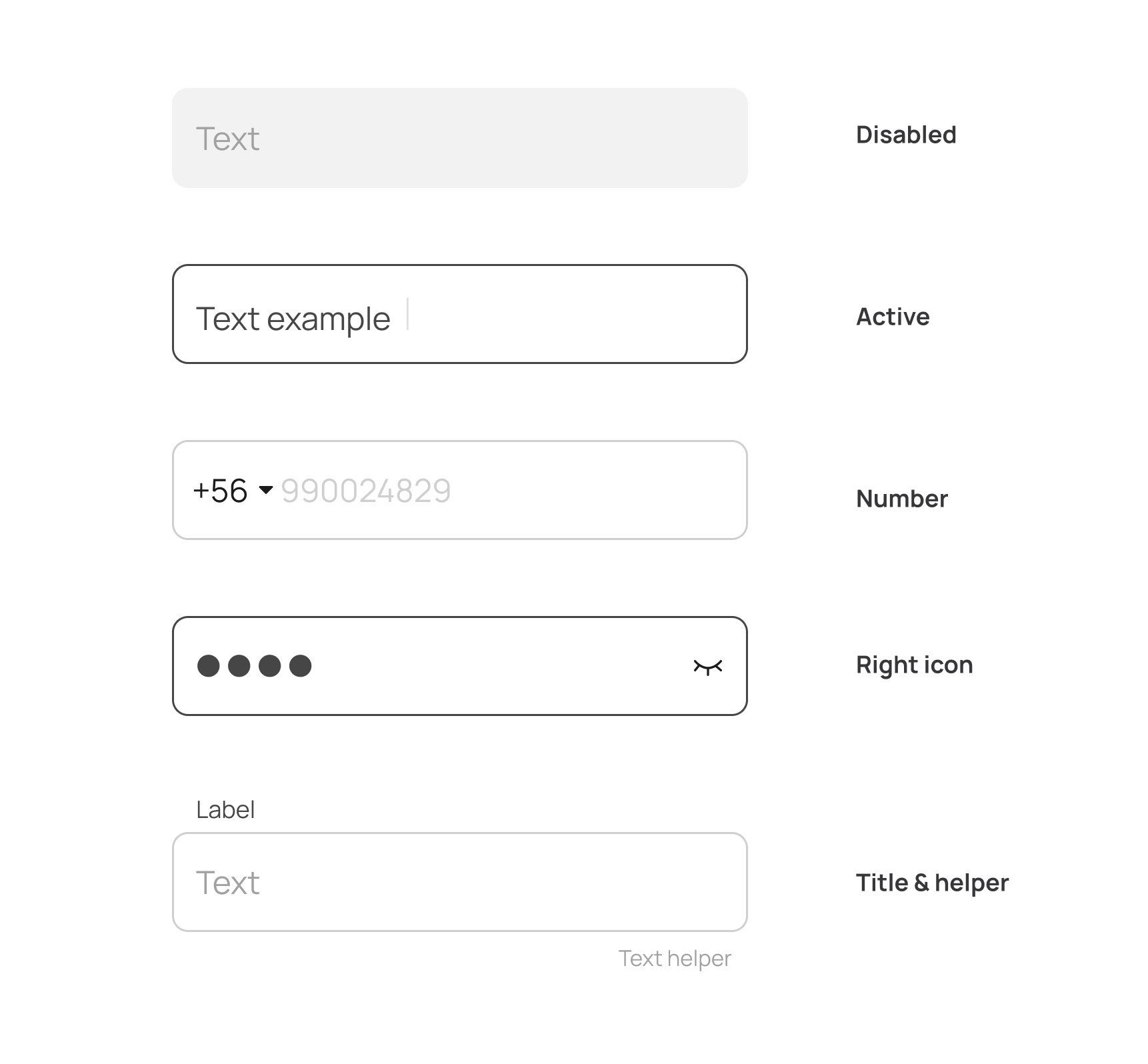
Input fields are built from reusable items/tokens: spacing, states, icons and labels. This keeps intertactions predictable and helps build forms faster

selectors
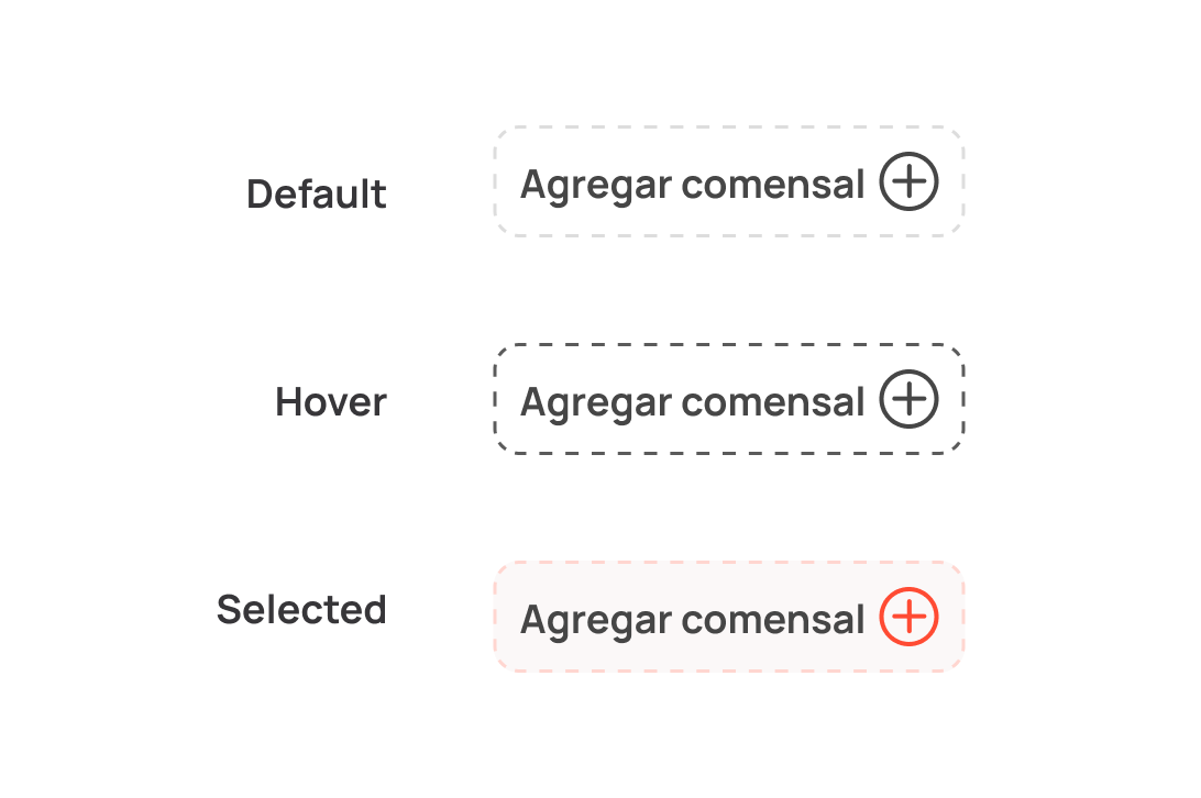
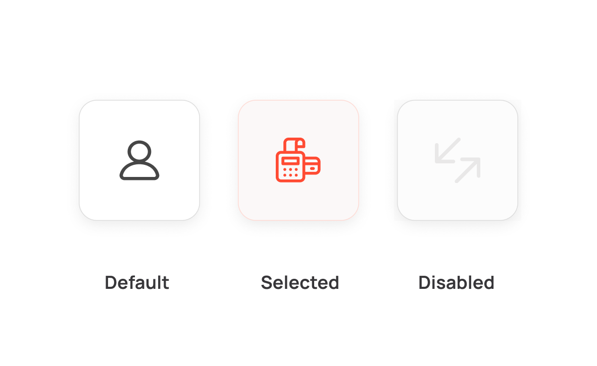
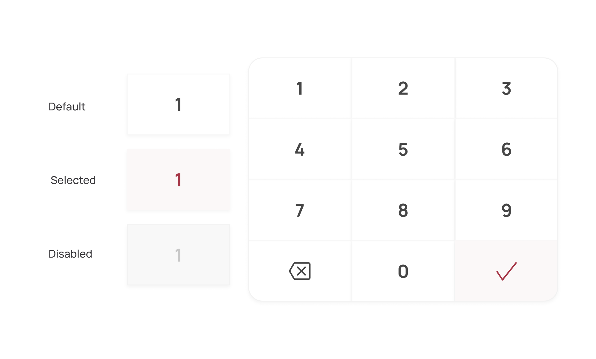
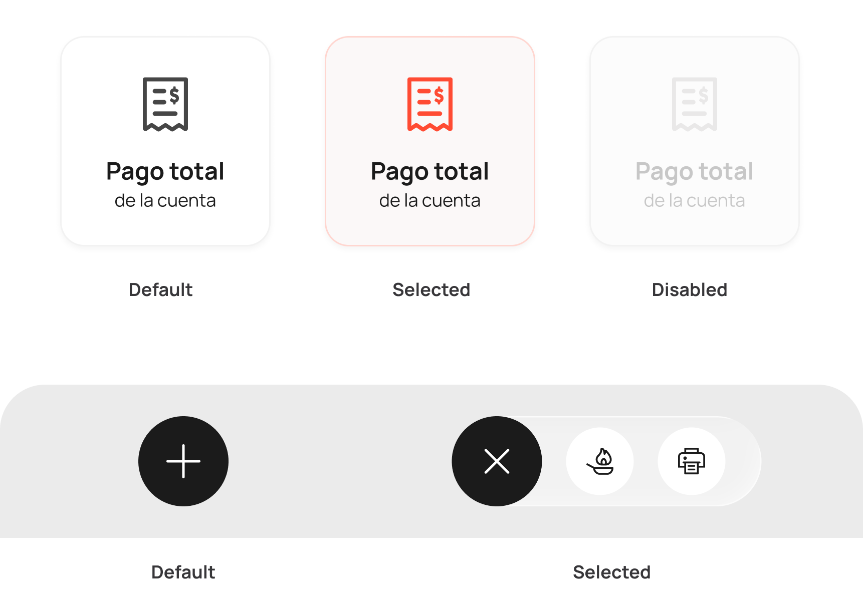
____ selector variants•
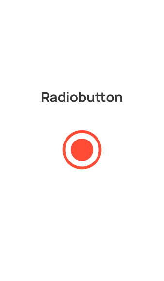
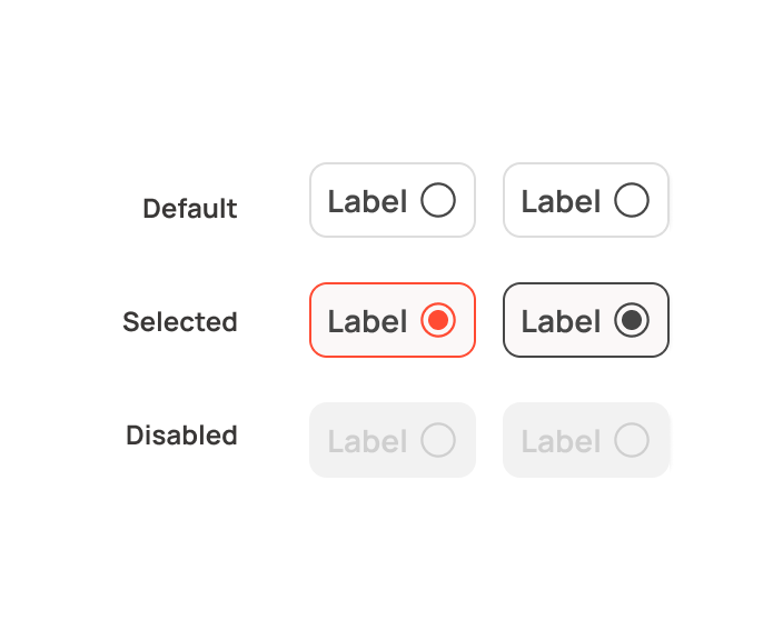
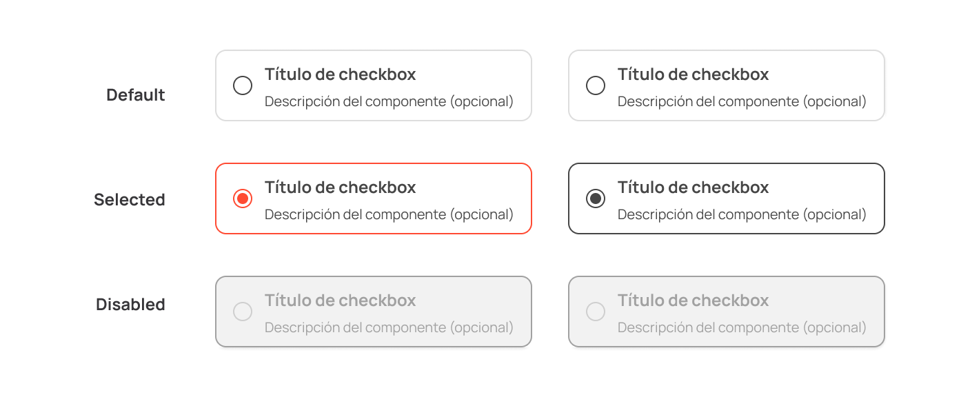
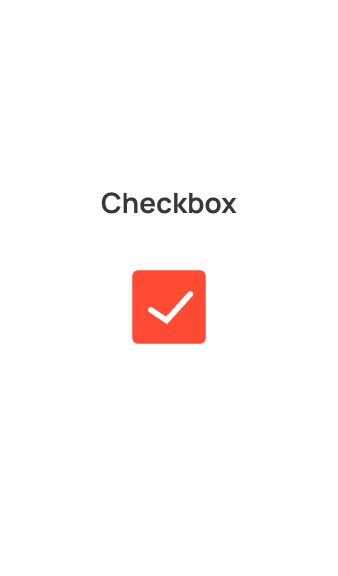
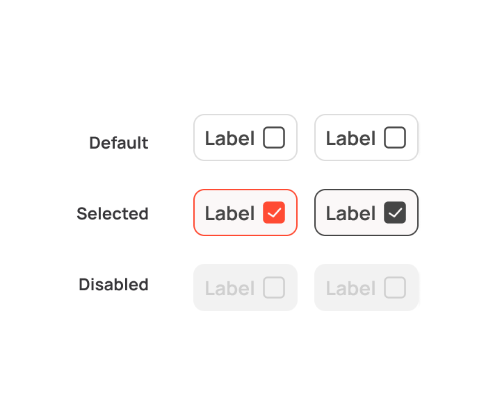
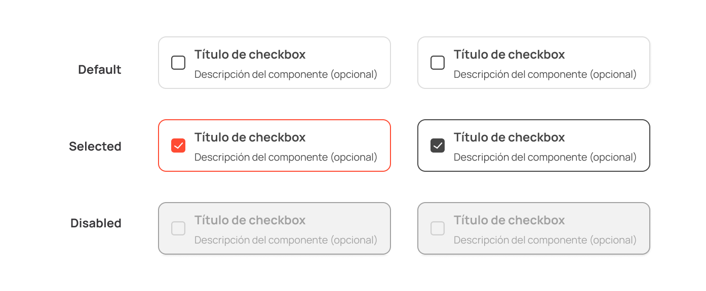
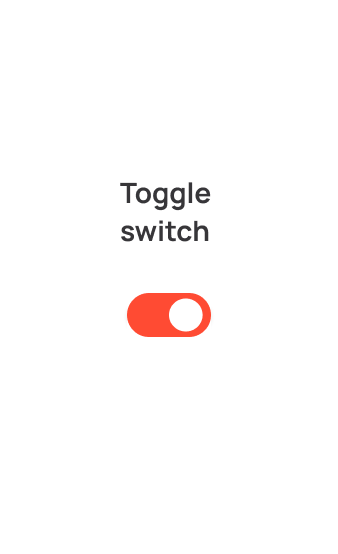
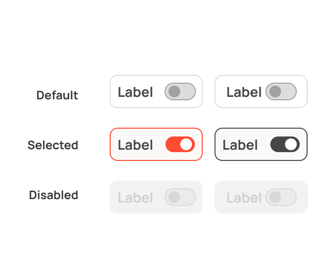
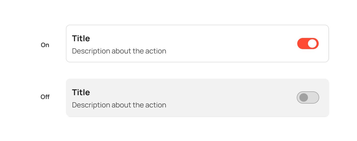
Components that establish consistent patterns for communicating available options, states, and ways of interacting within the interface.